
If you care about people using your site, a color contrast checker should be part of your day. A color contrast checker helps you pick text and background colors that people can read with ease. It also helps your business. Good contrast cuts support costs, lowers risk, and boosts trust. It is a UX win and a legal win.
Let’s keep this simple. Some people have low vision. Many of us use phones in bright sun or at night. Small text and light gray links make life hard. A color contrast checker shows you when color pairs are easy to read and when they fail. With it, you can fix problems fast and make pages clear for everyone.
What Is Color Contrast?
Color contrast is the difference between two colors. We look at how light or dark each color is. This is called luminance. When the difference is big, text pops and is easy to read. When the difference is small, words blur into the background. That hurts reading, clicks, and trust.
In real life, contrast shows up everywhere:
- Text on photos in a hero banner
- Buttons and links over a card
- Form labels and error messages
- Small tags, charts, and icons
Large text is easier to read than small text. So the rules for large text are a bit more relaxed. For normal body text, the target ratio is higher. You also need clear contrast for UI parts like icons, inputs, and focus rings. A color contrast checker helps you hit the right targets for each case.
What Is a color contrast checker and How Does It Work?
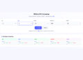
A color contrast checker is a simple tool. You choose a text color (foreground) and a background color. The tool calculates a ratio. That ratio tells you if the pair is readable.
You can enter colors in many ways:
- Type a color in hex, RGB, or HSL
- Use an eyedropper to sample colors from the screen
- Paste colors from a design file or style guide
Then you read the results. Most tools show pass or fail for WCAG AA and AAA. AA is the common bar for the web today. AAA is stricter. The tool will also note when you are close, so small changes can push you over the line. Some tools include checks for non-text items like icons and graphs.
Why a color contrast checker Is a Proven Accessibility Win
A color contrast checker makes sites easier to read for more people. It helps people with low vision. It helps people in bright light or on older screens. It helps kids learning to read and older adults too.
It also helps your business:
- Clear text means lower bounce and higher time on page
- Buttons with strong contrast get more clicks
- Forms with clear labels mean more completed sign-ups
- Fewer complaints and less legal risk
A color contrast checker keeps your brand clean across light and dark themes. It keeps colors steady across devices. Your style looks the same and works the same, everywhere.
WCAG Contrast Standards Made Simple
WCAG is the set of web rules many teams follow. Here is the short version:
- Normal text: aim for at least (AA)
- Large text (18pt regular or 14pt bold): at least (AA)
- AAA is stricter: normal text at least and large text at least
Icons and simple shapes also need enough contrast. For non-text UI parts, aim for at least .
Edge cases you should watch:
You might also like
- Gradients: the top and bottom of the gradient may pass, but the middle may fail. If you build gradients, try a CSS Gradient Generator to preview and adjust stops so text stays readable across the blend.
- Overlays: text on images often needs a dark or light overlay to reach the ratio
- Transparency: semi-transparent text can shift the final contrast and cause fails
- Disabled states: even “disabled” elements should be clear enough to understand
If you want a friendly, big-picture resource to share with your team, point them to Color Accessibility & Contrast so everyone uses the same plain-language guide.
How To Use a color contrast checker: Step-by-Step
Collect Your Color Pairs
Start by gathering the color pairs you use most:
- Brand primary and secondary colors
- Neutral grays for text and backgrounds
- States: hover, focus, active, visited, error, success
- Text on photos, cards, banners, and charts
Need to sample colors from screenshots or mockups? Use a Color Picker From Image to grab the exact hex codes. Building new palettes? Try Palette Generators & Extractors to create sets that already trend toward good contrast.
Test and Interpret
Open your color contrast checker and test each pair:
- Paste or pick your foreground and background colors.
- Check the ratio and note pass/fail for AA and AAA.
- Test each state: hover, focus, active, disabled.
- Test in light mode and dark mode.
Tip: Read your content in context. Headlines, body text, links, and form labels can have different needs. Check each one.
Iterate and Fix
If a pair fails, do not panic. Small shifts often fix it.
- Nudge lightness in HSL up or down a bit
- Reduce saturation if a bright color vibrates
- Try a darker text on light backgrounds and vice versa
Design systems people will love this: generate full, even color scales so you can swap in a nearby shade that passes. A Tailwind Colors Generator can help you pick steps that work well and are easy to remember.
Re-test after each change. Save the passing pairs as “approved” tokens in your library.
Validate in Context
Now test in the real world:
- Check live pages with your browser’s color contrast checker
- Read real text, not lorem ipsum: headings, body, links, help text, and form labels
- Look at error messages and tiny notes under inputs
Bring people into the loop too. Simple Ux testing helps you spot issues fast. Pair it with quick usability testing to see if people can spot links, read notices, and finish forms. If you run labs or surveys, list your favorite ux testing tools so the whole team can repeat the checks.
Choosing the Right color contrast checker for Your Workflow
Pick a tool that fits how you work:
- Accurate math and up-to-date WCAG rules
- Live sampling from the screen
- Batch testing for many pairs at once
- Support for different color formats (hex, RGB, HSL)
- Notes for text vs. non-text contrast
Common types:
- Browser extensions for quick checks on live pages
- Design tool plugins to test right inside your files
- Standalone web apps for focused audits
- Command line tools for automation in builds
Think about your team:
- Designers need quick visual passes and presets
- Developers need fast checks in code and CI
- QA needs repeatable steps to verify each release
- Content editors need simple “use this, not that” guidance
If you do not have staff time, consider outside help. Some teams lean on ux testing services to run regular checks and report clear fixes.
Fixing Failures Fast: Practical Color Adjustment Techniques
You can fix most contrast fails with tiny color moves that users will not even notice.
- Increase lightness for background colors under text
- Decrease lightness for text on light backgrounds
- Reduce saturation on neon hues that vibrate
- Swap a failing shade for a nearby one in your scale
For small UI parts, add clarity without changing brand color:
- Add a subtle outline or focus ring that meets
- Increase stroke width on thin icons or borders
- Use contrast-friendly badges for status text
Want to boost depth and separation for buttons or cards? Try a Box-Shadow Generator to add a soft shadow that improves shape clarity while text stays high-contrast.
Real-World Examples and Before/After Comparisons
Example 1: Hero text on a banner
- Before: White text over a bright, busy photo. In sunlight, the words vanish.
- Fix: Add a dark overlay to the image and switch white text to a slightly warmer, stronger white. The pair now meets . Result: The heading snaps into view, and the subhead is easy to read.
Example 2: Buttons and links
- Before: A pale brand blue button with white text fails. The hover state is even lighter.
- Fix: Use the next darker brand shade for the button background. Keep white text. The pair passes AA for both default and hover. Add a strong focus ring that hits . Result: Clicks rise and forms get finished.
Example 3: Charts and data
- Before: Thin lines in low-contrast colors make the chart hard to read.
- Fix: Pick darker hues for lines and labels, and lighten the grid. The legend text now meets . Result: People can tell one line from another at a glance.
Integrating a color contrast checker Into Your Design-to-Dev Pipeline
Make contrast a habit, not a one-time fix:
- Add a contrast check to every design review
- Include pass/fail notes in specs and tickets
- Run automated checks in CI so builds fail when contrast fails
- Keep a shared set of “approved” color tokens
- Train new team members with a short playbook
If your team is busy, set up a monthly or quarterly audit. It can be internal or done by a partner. Some teams book ux testing services to keep an outside eye on new pages, ads, and campaigns.
Common Mistakes to Avoid
- Testing only the default state, and skipping hover, focus, and disabled
- Passing in light mode but failing in dark mode
- Checking text and forgetting icons, charts, and form outlines
- Relying on screenshots that distort colors
- Using tiny type that makes contrast less useful even when it “passes”
- Ignoring users with color vision differences
Accessibility Beyond Color Contrast
Contrast is huge, but it is not the only thing that helps people.
- Typography: use readable sizes, good line height, and clear letter spacing
- Space: add white space so eyes can rest and scan
- Focus: make focus rings visible for keyboard users
- Targets: make buttons big enough to tap
Simple shape tweaks can help too. If your buttons look too similar, try a Border-Radius Generator to make primary and secondary buttons easier to tell apart at a glance.
SEO and Performance Benefits
Good contrast improves reading. People stay longer and bounce less. Search engines notice when users stick around, click, and come back. Clear CTAs get more clicks. Forms get more submissions. Support costs go down because users can find what they need.
Fast, readable pages also help performance. When text is clear, you do not need heavy images to explain your point. Clean UI and fast content loads make both people and search engines happy.
Implementation Checklist
Use this checklist to roll out a color contrast checker across your site and apps:
- Inventory colors across all templates and components.
- Test each pair with a color contrast checker and record the ratio.
- Adjust failing pairs by nudging lightness or swapping to a nearby shade.
- Re-test after each change and mark “approved” pairs.
- Update tokens in your design system and code base.
- Re-validate after releases, redesigns, or theme changes.
- Train your team with a short guide and examples.
- Add checks to design reviews and code PRs.
- Run spot checks on live pages before big launches.
- If you need help, hire ui ux designers to accelerate the setup and training.
While you work through the list, remember special cases:
- Gradients and overlays need extra checks
- Tiny text and thin icons need more contrast
- Error and warning colors must be strong and readable
FAQs
What contrast ratio should I target with a color contrast checker?
Aim for for normal body text and for large text under AA. If you can, shoot for AAA: for normal text and for large text. For icons and simple shapes, aim for at least .
Does a color contrast checker work for images with text?
Yes. But text on photos can be tricky. Use an overlay to darken or lighten the image. Then pick a text color that meets the ratio. Test the real photo, not a placeholder. Move the text over different parts of the image to be sure it stays readable.
How often should I run a color contrast checker?
Make it part of daily work. Check during design. Check in code. Check before release. For safety, schedule a quarterly audit to catch drift across pages and campaigns.
Can brand colors stay the same and still pass?
Often, yes. You can adjust tints, shades, or pairings to meet the ratio while keeping the core color. If a core brand color is too light, keep it for backgrounds or accents. Use a darker sibling for text or buttons. Save both in your system so the team knows which to use.
Tools and Tips That Play Nice With a color contrast checker
To speed up your work, use helper tools that fit with contrast checks:
- Build friendly color scales with design tokens
- Preview color steps against light and dark backgrounds
- Create consistent shadows and shapes for clarity
- Check states and content, not just one-off swatches
As you tweak colors, a CSS Gradient Generator helps you preview text on blended backgrounds. For design system work, pair contrast checks with Color Accessibility & Contrast guidelines so writers, designers, and developers stay aligned. When you need palette ideas that still pass, lean on Palette Generators & Extractors. If your chart or card needs depth, reach for a Box-Shadow Generator. And when you adjust shapes for clarity, a Border-Radius Generator can give buttons and chips more distinct forms without breaking your brand. If you build utility-first themes, a Tailwind Colors Generator can speed up token creation and help you avoid clashes across states.
Finally, test with people. Add quick Ux testing to your sprints, and back it up with lightweight usability testing. Keep a short list of ux testing tools your team trusts. If your org is large or under time pressure, bring in ux testing services for periodic reviews so you never slip.
Conclusion and Next Steps
You want a site that anyone can read, on any screen, in any light. A color contrast checker makes that real. It guides you to better pairs, stronger buttons, and clearer forms. It protects your brand and helps you meet standards. Most of all, it helps people.
Start today:
- Pick one page and test every color pair
- Fix the fails with tiny shifts
- Save your passing pairs as tokens
- Add a quick contrast check to each review
Make contrast a habit. Your users will thank you, your team will ship faster, and your business will grow. Ready? Open your color contrast checker now and take the first step toward a more accessible, more effective site.